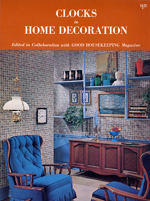
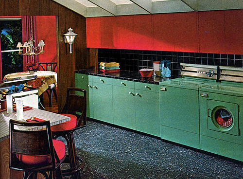
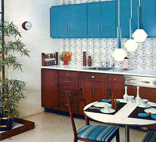
I recently picked up this great book & catalog at a garage sale. It was published by Westclox in association with Good Housekeeping magazine and it features a ton of great snapshots of style conscious 1965 interiors. I love '60s design and I found it really inspiring. I especially love the colorful kitchens! I thought I'd scan some of my favorite images from the book to share. Hope you enjoy them!
If you'd like to see a few more pictures from the book you can find them in my "Clocks In Home Decoration (1965)" Flickr Gallery.
Subscribe to:
Post Comments (Atom)

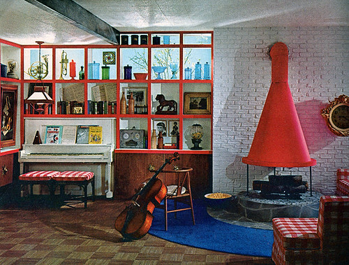
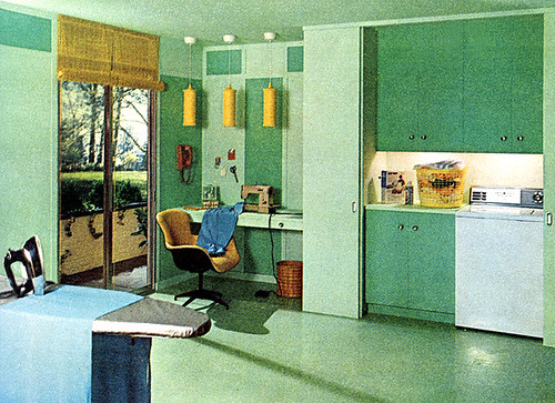
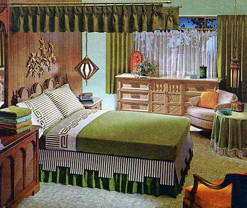
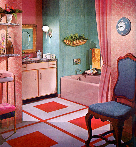


I find some of the mixes of Early American, French, modern and who-knows-what to be a little jarring...but interesting. And that's a very unusual take on a canopy over the green bed. Sometimes I'm a little taken aback by the way we really decorated back then, as opposed to the way we interpret mid-century decor today. I almost think we appreciate and put it together better now than then.
ReplyDeleteReally? I personally find a lot modern interpretations of mid-century design to be really conservative and dull. I think there's a lack of color and imagination today. I'm not all that fond of the early American influence & French provincial style myself but it was hugely popular in average American homes at the time (and even now for that matter). If done right in the right home, like a Storybook Ranch house or mid-century cottage, I think it can look really cute. Just depends on how it's put together I suppose.
ReplyDeleteMaybe it's that I grew up with a mom who had no real interest in decorating, so our house was a mish mash of all those styles, without any rhyme or reason...like an ornate gold and white ceramic lavabo with plastic grapes hung right beside a sleek room divider. I guess I'm overly sensitive. :)
ReplyDelete